It’s that time again–that time of year when Pantone releases its top color picks for the new season. Pantone’s color choices tend to define the upcoming season, and this year’s batch is so beautiful, we can hardly wait for autumn to officially arrive.
According to the color authority, this 10-color palette inspired by “tranquility, strength, and optimism,” acts as “playful but structured departures from your more typical fall shades.” Let’s take a look at the colors that will dominate the fall season and how you can use them in your home.
Riverside
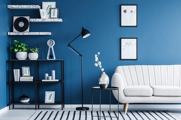
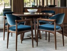
Not too serious, not too bright, but just right. Riverside is just as cool and calming as it is strong and stable. Blues cover a wide range, reaching both fun and sophistication, and this particular shade of blue is definitely a unique balance of both. Riverside certainly takes the lead in this season’s palette so don’t hesitate to try it anywhere.
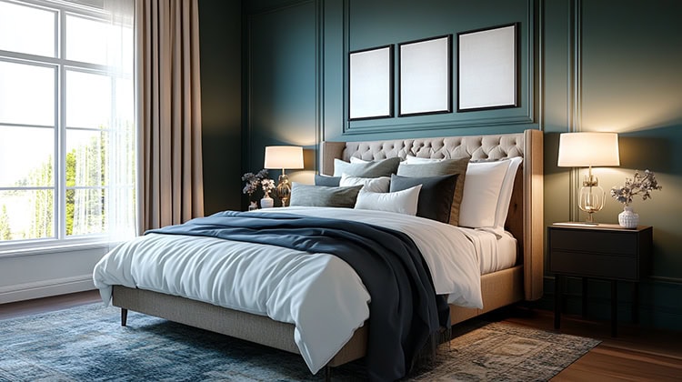
Airy Blue
Airy Blue is a bit like Serenity, one of Pantone’s colors of the year. If you want to lighten up a heavy-looking space, then this color will do it. Consider using it in a bedroom on walls or on linens. To enhance the look, pair it with Lush Meadow, Warm Taupe or Dusty Cedar.
Sharkskin
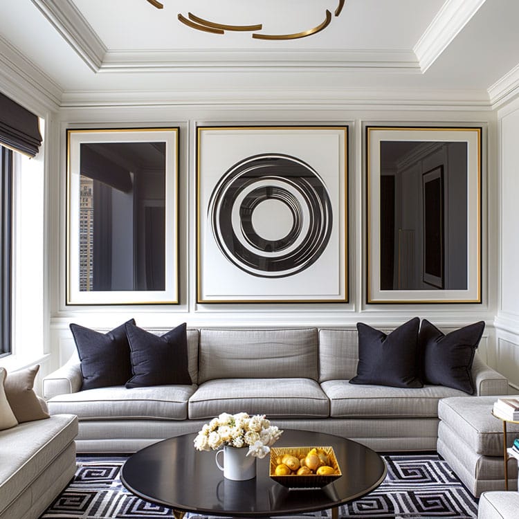
Gray is the new beige–and this hue serves as a stunning neutral. It’s easy to pair with practically any color, but especially with the other nine in this fall palette. Use it on your walls, floors, or furniture to help your favorite colors pop.
Aurora Red
Warm, exciting, confident, and pleasing to the eye–these are just some of the words that come to mind when looking at this dynamic color. Use Aurora Red in the kitchen or dining area. Or better yet, somewhere completely unexpected like a powder room. For an easy seasonal update, consider some accent pillows in this hue.
Warm Taupe
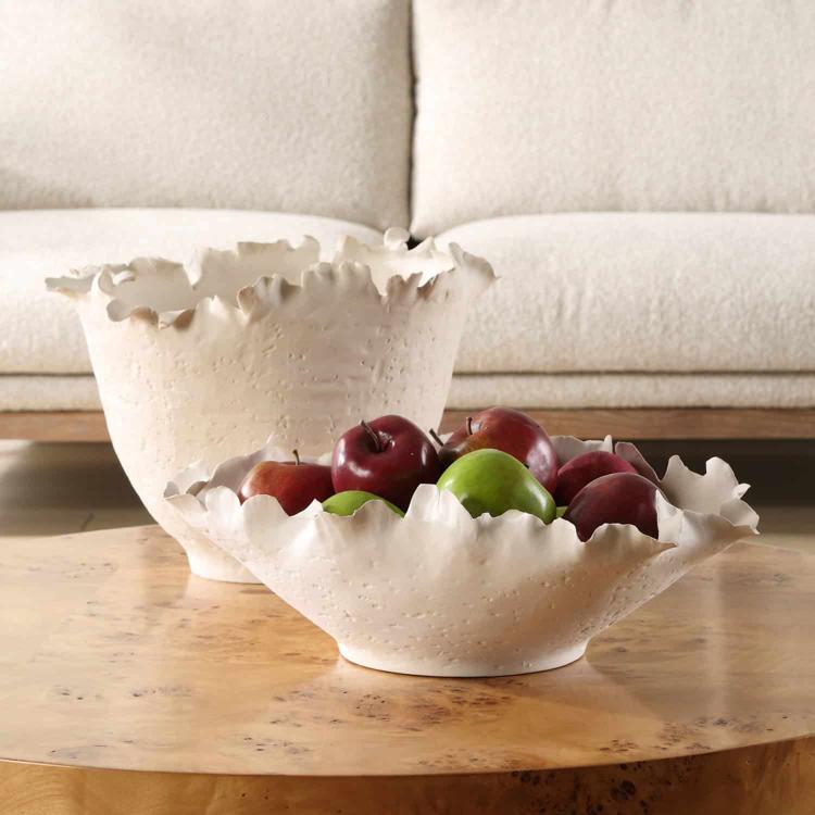
Taupe is timeless–and this year’s pick will give you an organic and grounded look. Use as a backdrop for other colors within the palette by keeping it on the walls, the floors, or on a piece of furniture.
Dusty Cedar
A deeper take on the shades of pink we often see in spring. This hue is warm and welcoming. Consider it somewhere in the entryway, like on a bench cushion, accent chair, or floor runner.
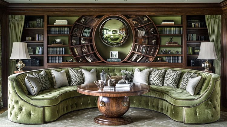
Lush Meadow
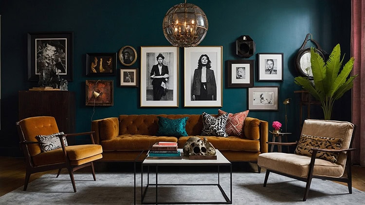
An elegant green that brings nature to mind. Consider adding this rich and sophisticated color to your home by way of window drapery or knit throws.
Spicy Mustard
This spicier and zestier version of traditional yellow can easily uplift a space. Because of its unusual shade, use it in smaller doses. Think a table lamp, picture frames, and other accessories.
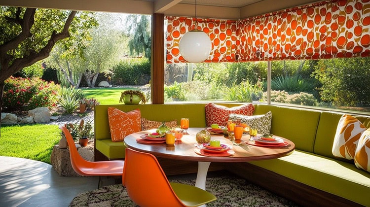
Potter’s Clay
A strong color that can be best described as a russet orange–a color typically expected this time of year. Use on accent pillows, throws, accessories, or a lampshade to bring in a pop of autumn.
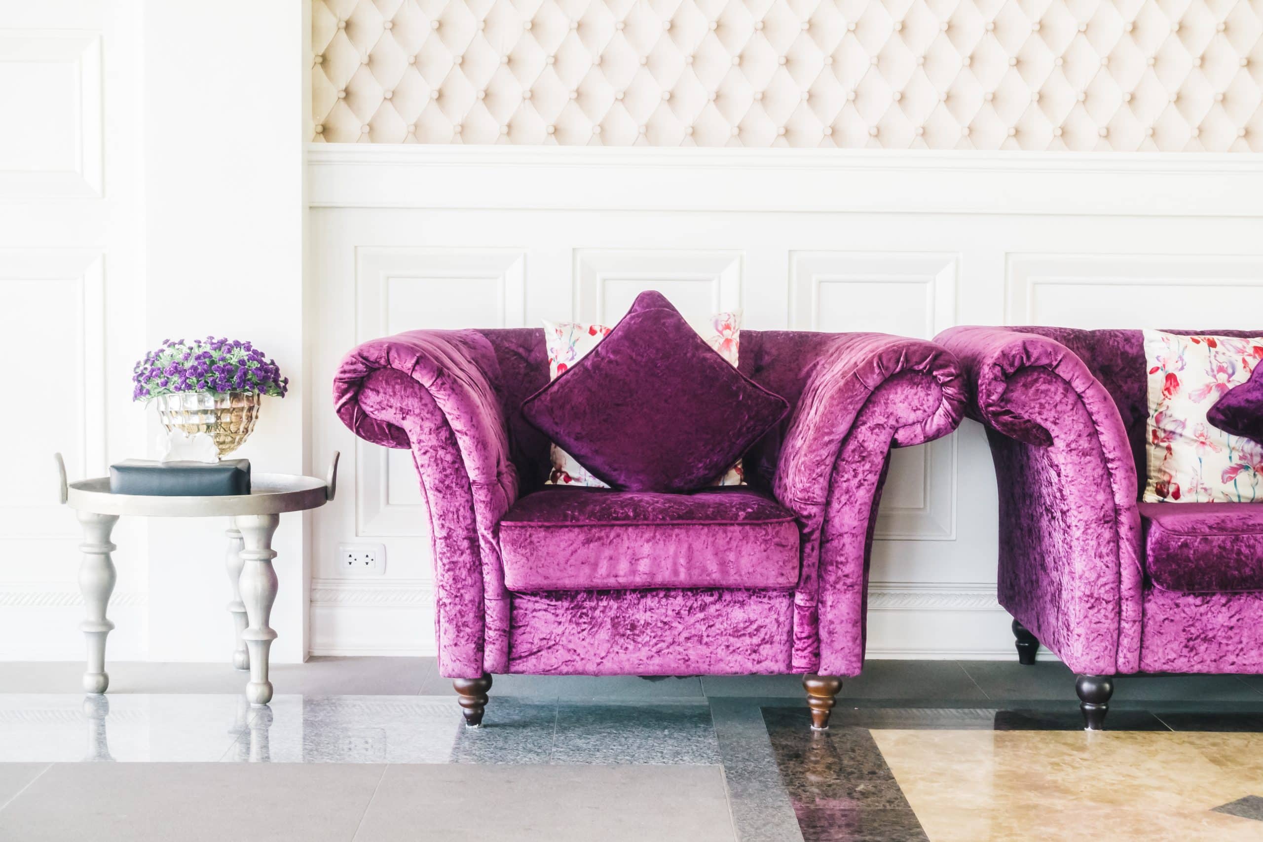
Bodacious
Although a color such as this is unexpected in fall, it doesn’t make it any less fitting. Surprisingly versatile, this color can pair up with pinks and reds, making it a color that will most definitely make a statement when used. Test the waters by keeping the color on localized to accessories or dive right in by having an accent chair or ottoman upholstered in it.

