As we approach the new year, it’s likely we’ve all got our sights set on bigger and brighter things. Based on Pantone’s Color of the Year choice, it’s obvious they too have their sights set in the same direction. After 22 years, Pantone has created a brand new hue specifically for 2022: Very Peri (PANTONE 17-3938).
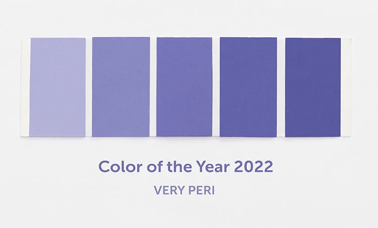
Very Peri: Creative and Imaginative
If purple seems like a familiar and recent Color of the Year, you’d be right. Just a few years ago in 2018, Pantone’s choice for the year was Ultraviolet (PANTONE 18-38380), a blue-based purple that was meant to represent a time of moving forward. Unfortunately, 2020 happened, throwing a temporary wrench into that journey. Now, as we start to put one foot forward again, Pantone is putting purple back in the forefront— this time, a dynamic periwinkle blue hue with a vivifying violet-red undertone that’s meant to “blend the faithfulness and constancy of blue with the energy and excitement of red.”
Here’s what Latrice Eiseman, Executive Director of the Pantone Color Institute had to say about this brand new hue: “As we move into a world of unprecedented change, the selection of PANTONE 17-3938 Very Peri brings a novel perspective and vision of the trusted and beloved blue color family, encompassing the quality of the blues, yet at the same time with its violet red undertone, PANTONE 17-3938 Very Peri displays a spritely, joyous attitude and dynamic presence that encourages courageous creativity and imaginative expressions.”
Learn more about Pantone’s Very Peri.
Using Very Peri In the Home
A bit of a unique color, to say the least, Very Peri is actually very compatible with an array of materials, textures, and finishes, making it easier to use than you may realize. Don’t hesitate to pair it with textures like leather or velvet.
Very Peri is a fresh color, so of course, it should be added to your home in a fresh way. Consider trying it out on wallpaper, pillows, art, and even a small piece of furniture.
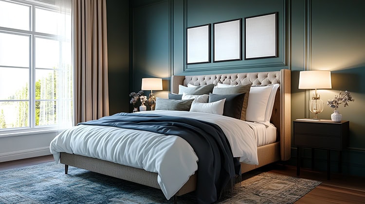
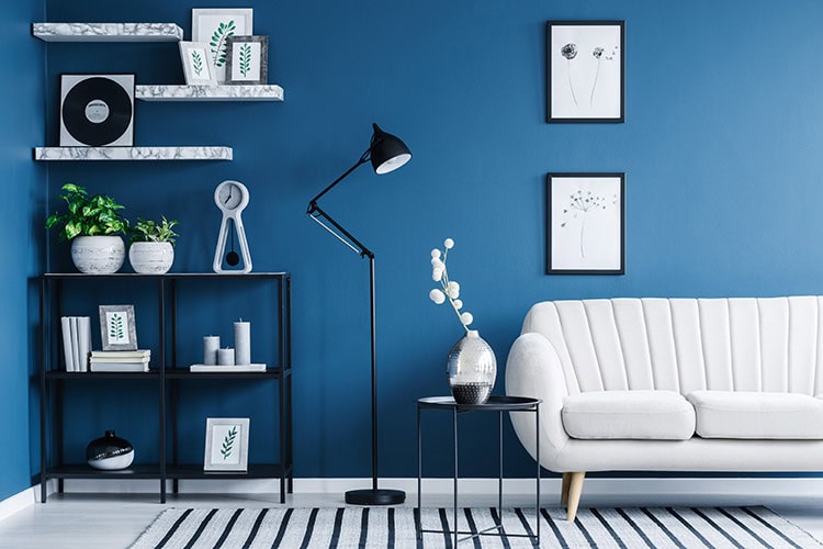
Being a more vibrant color, Very Peri serves as a wonderful accent color among neutrals such as taupes and creams, or deeper shades like navy or brown. With that said, there are a wide variety of warm and cool tones that when paired with Very Peri, can really shake up your interior’s decor. To discover what colors can help make a major statement by bringing Very Peri to life in your home, check out Pantone’s Color of the Year 2022 Palette Exploration.
Whether you’re looking for periwinkle hues or something entirely different, come stop by the showroom to see what we have to offer. From upholstery fabrics, furniture, and accessories, we have a wide variety of items that will help you complete any home decorating project.

