You don’t have to hire a designer to coordinate fabrics for your home. Just by keeping the elements of color, texture and pattern in mind, you can get that beautiful look all by yourself. Let’s dig deeper into these three elements to make coordinating fabrics a little easier.
Color
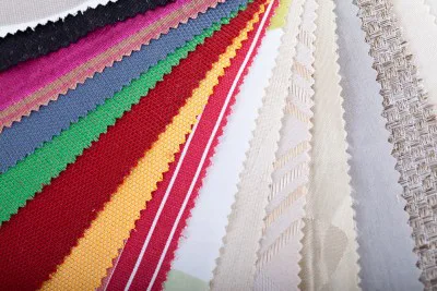
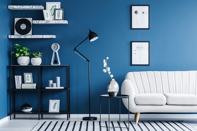
We are drawn to colors for various reasons, so its no wonder color is primarily the driving force behind our decorating choices. With that said, when it comes to decorating the home, you should look for colors that complement, rather than compete with one another. Look for one specific color that’s similar in both temperature and intensity. Colors such as this will carry though the space nicely and tie it all together. If you wish to increase the continuity, pick a secondary color.
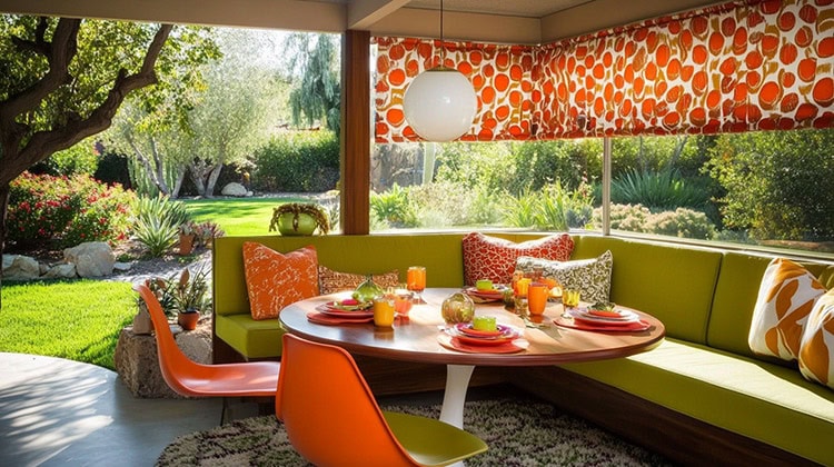
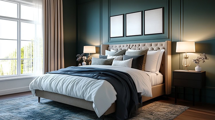
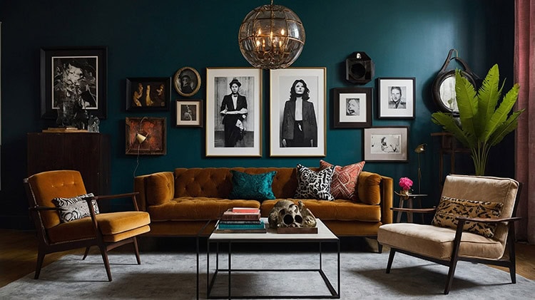
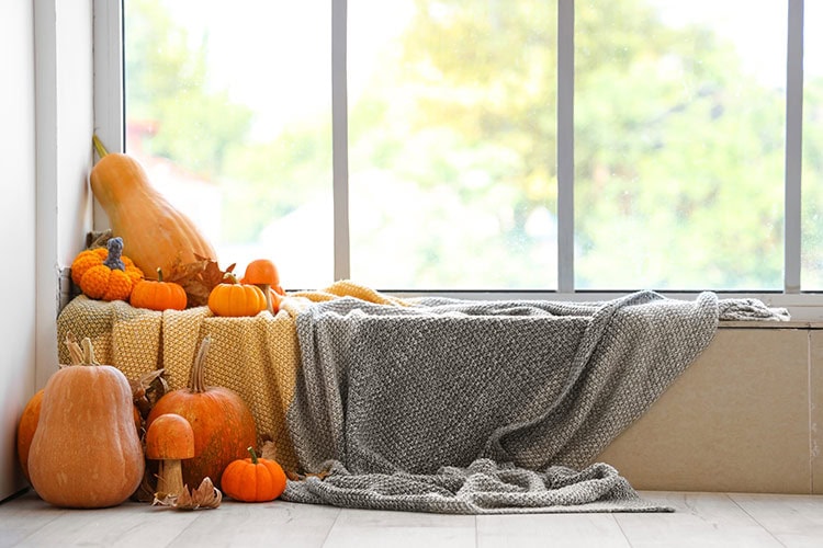
Colors generally fall under two categories: warm and cool. Warm colors, such as reds, oranges, and yellows make a space feel cozy and intimate. Cool colors, such as greens, blues and purples, soothe and brighten the space. To find balance, avoid having all warm or all cool colors. Balance and contrast are important, so it’s best to pull from both categories.
Texture
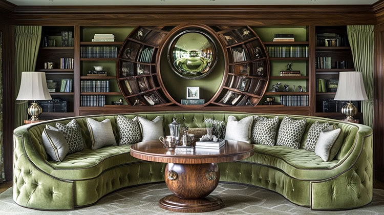
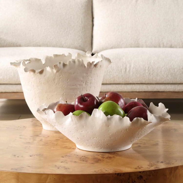
Texture in fabric is essential because it influences the durability and also sets the mood for the room. Take the kind of room into consideration. Is it formal or informal? Fabrics like lace, satin, velvet or damask are smoother, making them perfect for formal areas. Leather, tweed, velour, wool, corduroy or cotton, are great fabrics for high-traffic living areas. Sensuede, vinyl, and fabrics used for outdoor furniture, stand up well against pets and children. If you want to create a romantic feel, stick with fabrics like organdy, tulle, taffeta and antique satin.
If you really have no desire to create a particular theme, then feel free to mix heavy and light fabrics together in the same room. The blend of both types can look amazing when done correctly, so don’t be afraid to get creative.
Pattern
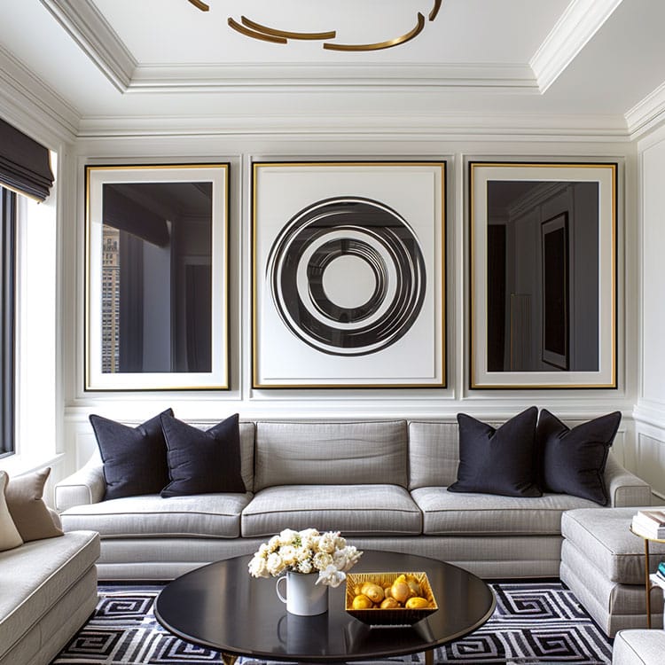
A general rule to live by when coordinating fabrics is to exceed no more than three patterns. These three consist of one large-, one medium-, and one small-scale pattern. To get it right, pick a large pattern, add a second pattern, similar in color, yet half the size of the first, and then finish it off with a solid color pulled from the first two. If you stick with complimentary colors, you can pick a fourth pattern with a miniscule pattern, skipping the solid one altogether.
Just like texture, pattern can create a mood. Large, bold patterns evoke energy, while small and pale patterns bring about a calming effect. To keep it balanced, spread the patterns around the room, rather than putting them all in one place.
If you have fun and stick with the basics, it’ll all come together. Just let your creativity and personality guide you.
Come to see us at Interior Fabrics Houston to see the newest discount fabric arrivals. We are located at 3104 Fondren Rd. Houston, TX, open Monday – Saturday!

