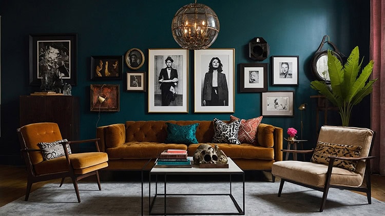
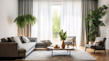
Did you know that it doesn’t take an experienced touch to get great decorating results? By playing up your home’s strengths— and maybe disguising a few of its flaws— your home can be an appealing one. In most cases, all it takes is resorting to tried and true techniques to get the beautiful space you want. Whether you’re focusing on your entire home, or simply just a room, here are 10 key decorating tips that will offer no-fail improvement.
1. Make paint color last on your list.
There is an abundant number of paint colors with various tones, tints, and shades. If you want to get it right, make paint the last thing you choose. Plan out the room first and then select the paint to support all of the other things you have going on within the space. You can take your color cues from fabrics, whether it’s accent pillows or an occasional chair that has a pattern or print to it. Simply put, decorating tip: it is much easier to match the paint with your furnishings than it is to match the furnishings to the paint.
2. Resist crowding the room.
There’s no need to fill a room with a lot of furniture. This is especially true if the room is small. Be selective in your purchases, picking fewer pieces of higher quality. Not only will your pieces stand out more, but you’ll also be able to maneuver about the space with ease. The overall goal should be to have pieces that serve a purpose, not just take up space.
3. Hang artwork at the appropriate height.
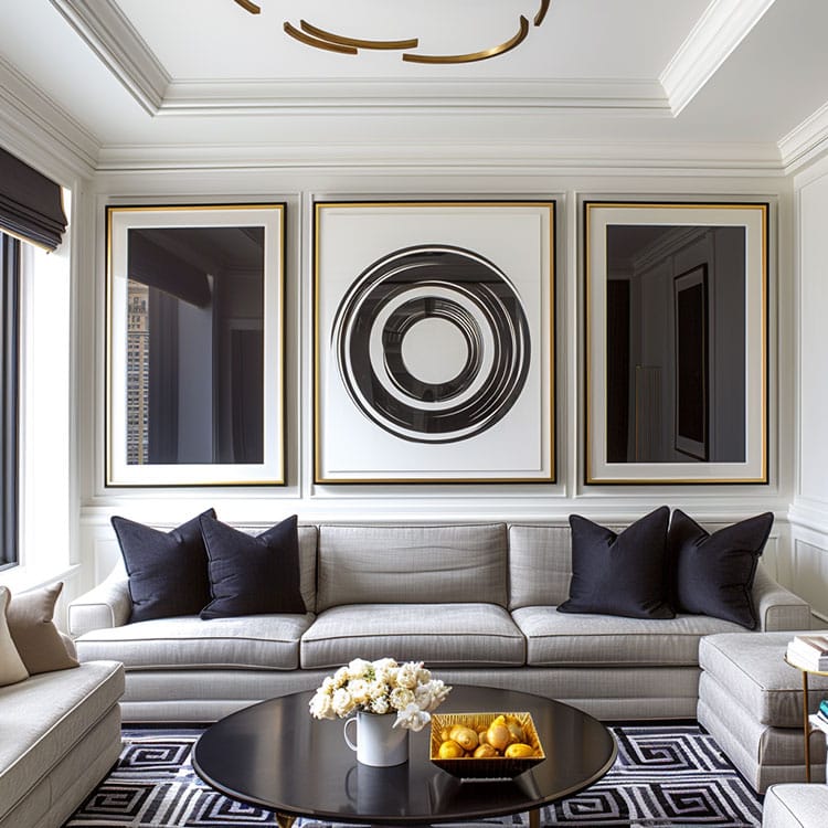
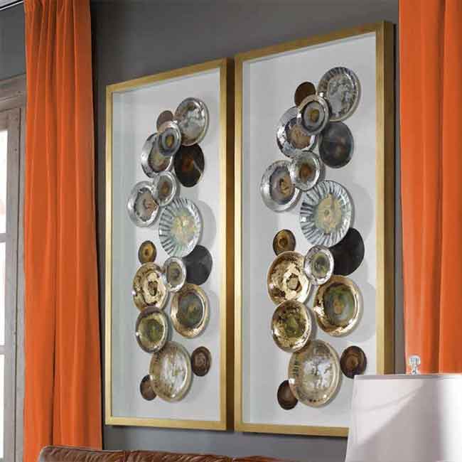
The average human eye level is 60 inches, so that’s where you should aim. For art that will be hung over the sofa, leave at least 6″ – 8″ inches of space between the top of the sofa and the bottom of the picture. Keep in mind the hanging needs to relate to the human scale, rather than the scale of the structure.
Another option is to create a gallery wall by hanging a selection of artwork together. Hanging multiple prints in a grid can have just as much impact as hanging one large piece of art.
4. Create a focal point.
Choose one thing and make it the star of the room. Trying to make several focal points only creates visual confusion. Additionally, consider sightlines within the space. The focal point should draw you into a room, which is why the best spot is often directly across from the entrance to the room.
What are some great focal points? Quite a few things really, but we suggest utilizing architectural features, artwork, texture, pattern, and color. To learn more about how to put these elements to work as focal points in your home, read our blog 5 Great Focal Points to Help Jumpstart Your Design.
5. Avoid diving headfirst into themes or trends.
While there’s no decorating law that says you can’t have a themed or trendy space, it’s recommended that you err on the side of caution. Why? Well, themes often lack individuality, and trends come and go quickly. If you end up going all-in with either— especially when big-ticket items are involved — you might be stuck with the look for quite a while, which won’t necessarily be a good thing if you end up dissatisfied. As a general rule, it’s best to save themes and trends for small accents.
6. Give in to your bold side.
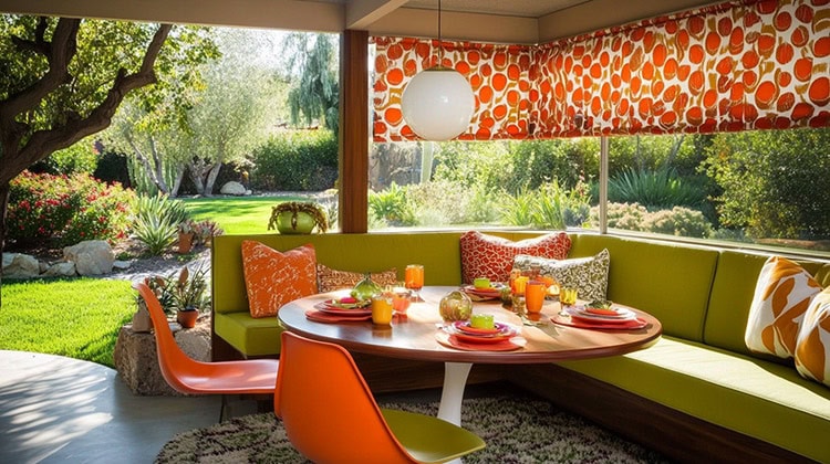
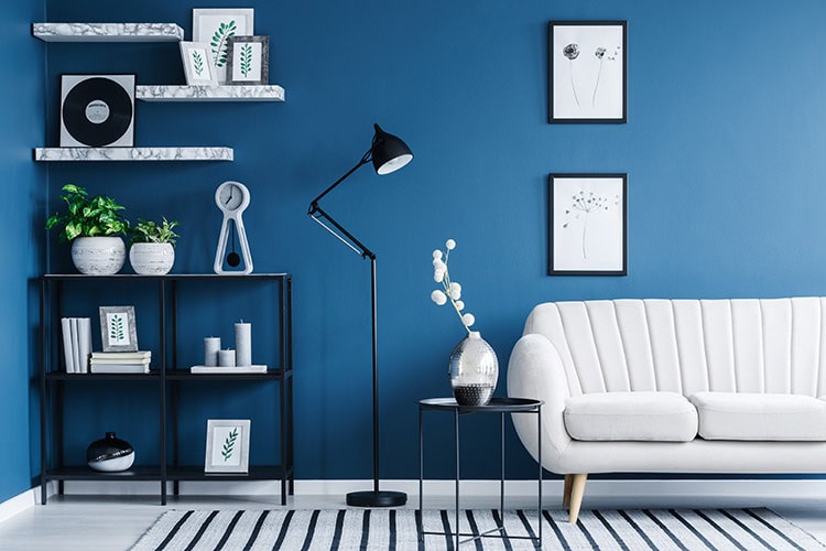
Don’t be afraid to make a statement by adding a touch of drama to your space. Walls, furniture, and accessories are three wonderful and easy ways to really make a statement. Sure, it can be risky, but sometimes risks need to be taken. Incorporate the unexpected and enjoy the results.
7. Arrange furniture on a rug the right way.
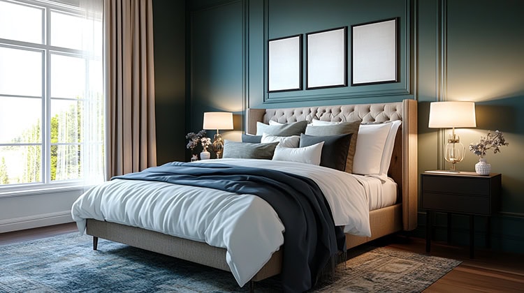
There are 3 acceptable ways to arrange furniture on your rug: 1) with everything on it, 2) with everything off of it, or 3) with only the front legs on— all of which, are typically dependent on the function of the room. For example, in the dining room, chairs should fit comfortably on the area rug, even in the pulled-out position. In the living room, an equal amount of exposed flooring around your rug will provide a sense of balance to the room. When it comes to the bedroom, the rug should fit easily underneath the bottom two-thirds of the bed.
8. Vary the scale.
Scale refers to visual size. In other words, how furnishings look next to each other and how they fit in a room. If everything within the space is the same size, nothing will stand out. To keep that from happening and to provide visual interest, be sure to vary items in both scale and proportion. Grouping items in threes and fives also make arrangements more pleasing.
9. Layer your lighting.
Lighting is one of the most overlooked yet important elements of interior design. Not only does it serve a functional purpose, but lighting also plays a huge role in the look of a space, so take time to incorporate more when you can. Lamps, sconces, and lighting in cabinets are all good ways to bring in layers of light. When possible add a dimmer so you can enjoy a softer glow.
10. Bring in your personal touches.
Following decorating guidelines is okay, but don’t neglect to add touches of your own personality. Add splashes of your favorite color. Hang up some of those family pictures. Adorn your tabletops with fresh cut flowers. The options of what you can do are seemingly endless. Be creative and make sure the place reflects who you are.
Visit us at INTERIOR FABRICS near Katy, TX to check out the latest designer upholstery fabrics available at amazing prices.

