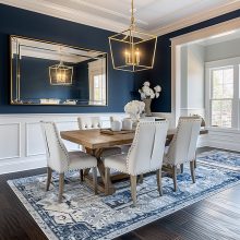
As a homeowner, you have the power to decorate how you see fit. From colors to fabrics to accessories, your home is the place where your style and personality can shine through. After all, if you can’t create a space that truly reflects who you are, what’s the point? With that said, certain guidelines will make or break a fabulous interior. Let’s take a look at what some of those are.
Do: Pick out furnishings first.
A common misconception is that wall color should be chosen first. In actuality, it is much easier to match paint to your furnishings rather than the other way around. So, save the paint color for last.
Furnishings include items such as drapery, furniture, fabrics, carpets, and decorative accessories— and while there are a lot of options to choose from in this area, paint colors far exceed. Just walk into any paint store and you’ll be bombarded with selection. In the end, you’ll get the just-right look you’re going for by furnishing your home before painting it.
Don’t: Build off your favorite color.
Instead, find a complementary or neutral color for the backdrop, and then incorporate your favorite color in bursts throughout the space. Lampshades, accent pillows, artwork, area rugs, and accessories are all items that you could consider getting in that color you love so it can really be showcased. Being more selective about how you use your favorite color will feel refreshing rather than overbearing.
Do: Have an obvious focal point.
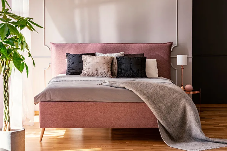
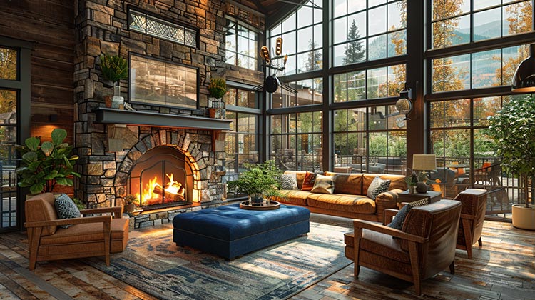
An excellent way to put a room together is by designing around a designated focal point. It doesn’t matter if it’s a fireplace, a window, a headboard, or a unique piece of furniture, identify what the focal point is and then arrange everything else in a way that makes it obvious as to where the eyes should go.
Don’t: Hang pictures too high.
As a general rule, paintings, pictures and such should be hung at eye level. Of course, this gets tricky when you have multiple pieces (like a gallery wall), have a huge wall you are trying to fill, are hanging above furniture, etc. However, if you are hanging a single piece of art, aim for the midpoint of the artwork to be about 60 inches off the ground. If you have to crane your neck to see a piece of artwork, consider lowering it.
This rule also applies to most gallery walls— the midpoint should be eye-level and then you can work out from there. For artwork over furniture, the bottom of the frame should be about 8-10 inches above the piece of furniture.
Do: Create a flow for traffic.
Traffic flow through the house can easily be created with furniture placement. For example, if you’d like to avoid the TV being blocked, just arrange your pieces in a way that creates a path around it, rather than in front of it. The goal is to have a defined path that isn’t inhibited by anything unnecessary.
Don’t: Put everything against the wall.
Some places don’t leave you many options, but more often than not, there is no reason to have everything shoved up against the wall. Leaving a hole in the center of a room isn’t cozy and comfortable but the furniture arranged in the center is.
Do: Purchase quality furniture.
Mass-produced furniture might come at a better price, but only initially. The truth is if it’s not quality it’ll end up costing you more in the long run. Since quality pieces are constructed better, you’ll likely have a solid frame fit for reupholstering in future years. Consider visiting a fabric store like ours to have a custom piece created for your home. Not only will it be quality, but you’ll also be able to select a fabric you’re over the moon about.
Don’t: Keep everything symmetrical.
Symmetry has a particular beauty, but when it’s overused, your home can begin to look stagnant. Throwing a little asymmetry into the mix will keep the space looking a bit more refreshed. Where symmetrical design is laid out as a mirror image, asymmetry is achieved by creating balance by repeating similar forms, lines, and colors. For example, a living room done in an asymmetrical style might feature a sofa with an end table on one end and a floor lamp on the other.
Do: Hang curtains high and wide on a window.
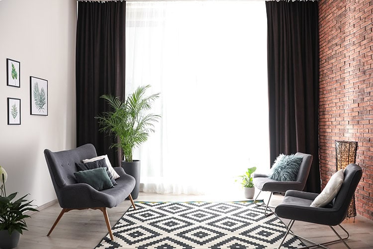
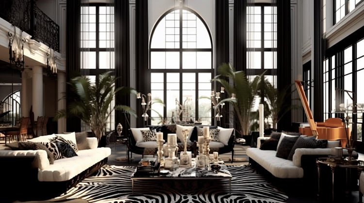
Hanging curtains and drapes in your home is an art— and it all comes down to where they are placed. Hanging them too low and too close together can make your home look small and awkward. On the other hand, hanging them as wide and as tall as possible can make your home look grand and beautiful.
Don’t: Use patterns in a room without varying scale.
When it comes to patterns, one needs to be the “star” and the other one or two your “supporting actors.” To keep it looking balanced, not busy, follow the rule of 3: 1 large, 1 medium, 1 small. Feel free to choose whatever patterns make you happy. Just make sure they share a complementary color that helps them coordinate.
Do: Vary the lighting.
A single overhead light can feel a little cold. To add warmth to the space, incorporate some lamps and sconces when able. If that’s not an option, consider installing a dimmer switch to soften the light you do have.
Don’t: Stray from what YOU want.
Taking advice from others is fine and dandy, but at the end of the day, you are the one who has to live there. Be sure to stay true to your design style and decorate in a way that makes you feel comfortable and happy.
Ready to create a fabulous interior? Come visit us at one of our retail locations or online! From fabrics and furnishings to lighting and accessories, we have something that will suit any design style perfectly.

