Since most of us aren’t interior designers by trade, it can be a struggle to find the right colors for your home. Sure, it’s easy to pinpoint the colors you love. Actually pulling them together into a scheme and decorating with color, whether for a single room or an entire house, however, is a whole different ball game.
Of course, there’s the option of hiring a professional when the time comes to decorate, but for most people, the decorating is something they have to do on their own. And that’s why we’ve put together this little color guide. The more you understand the language of color, the more confident you’ll feel the next time you’re looking at paint and fabric swatches for those home projects you take on.
Colors are Incredibly Influential
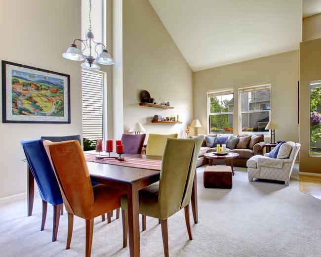
It’s no secret that colors are very complex. In addition to having their own character and behaviors, decorating with colors convey messages that can alter our moods. For example, a bedroom wouldn’t be nearly as calming and relaxing if you used bright colors, whereas a family room wouldn’t feel energizing if you used muted colors. This is why it’s so important to think carefully about what you want the room to express before you take on any color project.
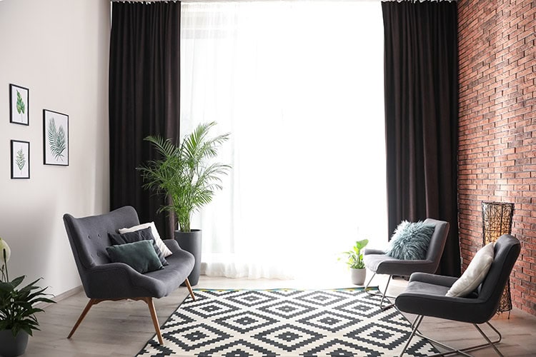
All colors change their character when there is a modification to the lightness and saturation, hence the reason we have so many options to choose from. As a general rule, lighter colors tend to make rooms feel larger and brighter, while darker colors make rooms feel sophisticated and intimate.
In regards to behavior, colors can either be active, passive, or neutral. Neutrals are those colors like black, gray, white, and brown, which serve as a middle ground for establishing the balance of active and passive shades.
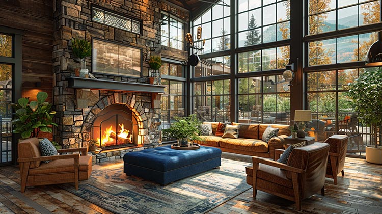
One last thing to talk about is color temperature. Colors are often talked about as being warm or cool, which is based on where they fall on the color wheel. Reds, oranges, and yellows are typically more vibrant and often bring a sense of liveliness and intimacy to a space. Colors like those are considered warm. In contrast, colors such as blues, purples, and most greens are considered cool, since they are often used to add a calming and relaxing effect to a room.
Decoding the Color Wheel
Now that you have a better handle on what colors can do, it’s time to talk about the colors themselves. The colors on the color wheel are organized and grouped into 3 categories: primary colors, secondary colors, and tertiary colors.
- Primary colors are red, yellow and blue. They cannot be made from mixing other colors together.
- Secondary colors are orange, green and purple. These colors are created when mixed from the two primary colors that flank them: red and yellow make orange, blue and yellow make green and red and blue make purple.
- Tertiary colors are a blend of a secondary color and the primary color closest to it on the color wheel. They are not half and half blends, but rather a blend containing more of one color than another. Mixing the primary color yellow, with the secondary color orange, will give you the tertiary color yellow-orange. Another example would be red (primary) mixed with orange (secondary), which would make red-orange. Other tertiary colors are blue-green, yellow-green, blue-violet and red-violet.
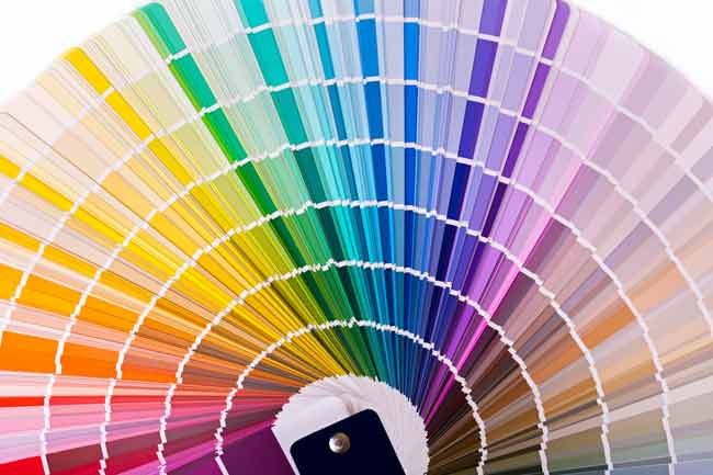
Now that you understand the 12 basic colors, let’s talk about how they can be altered with neutrals. In a nutshell, many different versions of color can be created within the same family when a neutral is introduced. Decorating with neutral colors is always in style. When a basic color is combined with a neutral color, it becomes lighter or darker. This is known as tint, shade, and tone.
- Tint is the act of making a color lighter by adding white to it. All pastels would be considered a tint.
- Shade is the act of making a color darker by adding black to it. All muted colors would be considered shades.
- Tone is the act of slightly darkening a color by adding gray to it.
Other Color Terms Worth Knowing
- Hue is the property of light by which the color of an object is classified as red, blue, green or yellow in reference to the spectrum. Basically, it’s just another name for color.
- Value refers to the relative lightness or darkness of a certain area. As a general rule, the colors of the same value work better together.
- Complementary colors are opposite to each other on the color wheel: green and red, purple and yellow, orange and blue. Other colors would include lime green and magenta and teal and coral. The high contrast of complementary colors creates a vibrant look especially when used at full saturation. You don’t have to stick with the literal colors on the color wheel in order to get complementary colors. Today, there are updated schemes that can be executed brilliantly with the wall color, accents, and fabric on chair cushions and pillows.
- Monochromatic colors are all the colors (tints, tones, and shades) of a single hue. For example, a monochromatic room in blue might start with a single shade of blue paired with white. It might also include pale blue walls, medium blue window treatments, and dark blue upholstery. To tie the scheme together, the rug or accents might be a combination of blue and white.
- Analogous colors are colors that are adjacent to each other on the color wheel. Some examples would be green, yellow-green and yellow or red, red-violet and violet.
Decorating with colors that you like will definitely show your individual touch and make your place a very special one.
If you still have questions, we will be happy to help you sort through our fabulous assortment of designer fabrics at Cutting Corners near Plano, TX. With a wide selection to choose from, you’re sure to find something that will fit right in with whatever color palette you decide on.

