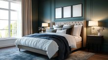
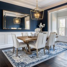
Ultimately, when it comes to designing a layout for your home, you need to decide whether you want that layout to be symmetrical or asymmetrical. The good news is that there’s no right or wrong answer — it really just boils down to your personal preference. With that said, it’s important to have a good understanding of the differences between the two so you can achieve the beautiful, eye-catching balance both have to offer.
What Is Symmetry?
The mathematical definition of symmetry states “symmetry is a mirror image.” And, that perfect reflection is often what first comes to mind, much like the butterfly we can find in nature. While that is probably the most common type of symmetry, it’s far from the only type of symmetry. In fact, there are several different types of symmetry!
There’s the bilateral symmetry of the Taj Mahal in Agra and the Pantheon in Rome. In Florence, Italy, both the Basilica di Santo Spirito and Florence Cathedral manifest rotational and reflection symmetry. The Sydney Opera House, designed by Joern Utzon in 1959, is an example of what’s referred to as similarity symmetry, while the Guggenheim Museum of New York is the perfect representation of spiral symmetry. Last, but certainly not least as there are still more types of symmetry, is the Rose window of Notre Dame Cathedral, Paris, which is a beautiful visual of radial symmetry.
The opposite of symmetry is asymmetry. A few examples of asymmetry include the Farnborough Airport Terminal Building in Farnborough, England, the Queen Sofia Palace of the Arts in Valencia, Spain, and the Walt Disney Concert Hall in Los Angeles, California. Even the painting Starry Night by Vincent van Gogh is asymmetrical in nature.
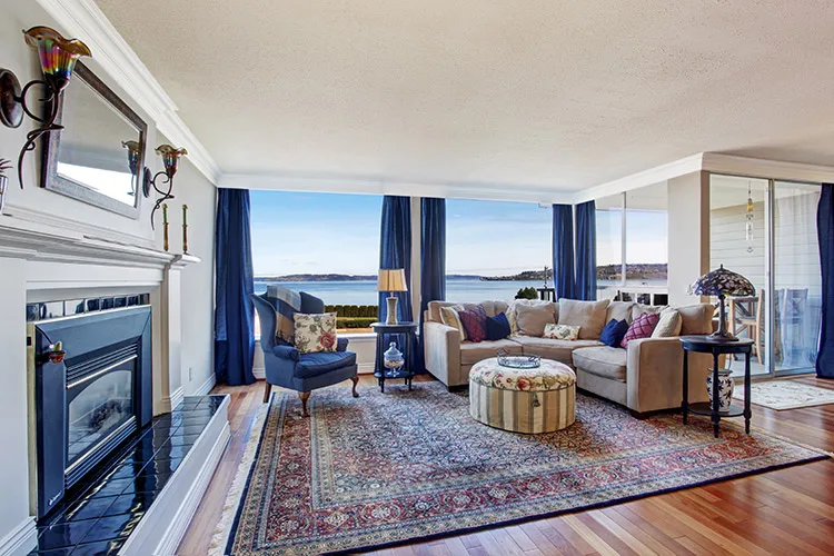
Regardless of what types of symmetry are represented in these buildings or paintings, there is a commonality they all share: there’s a sense of harmony and balance. That’s what symmetry is all about!
Symmetry In Interior Design
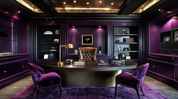
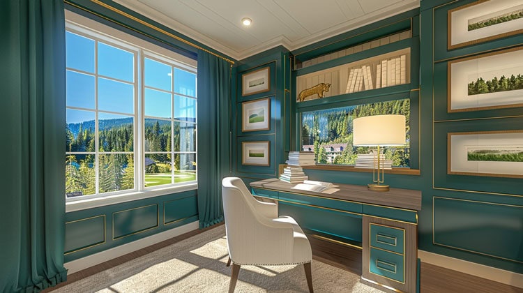
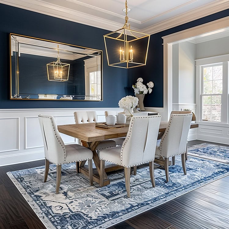
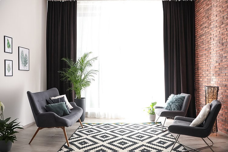
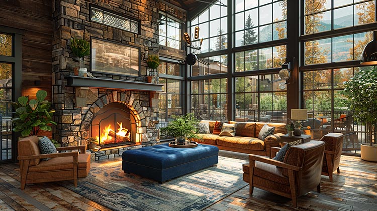
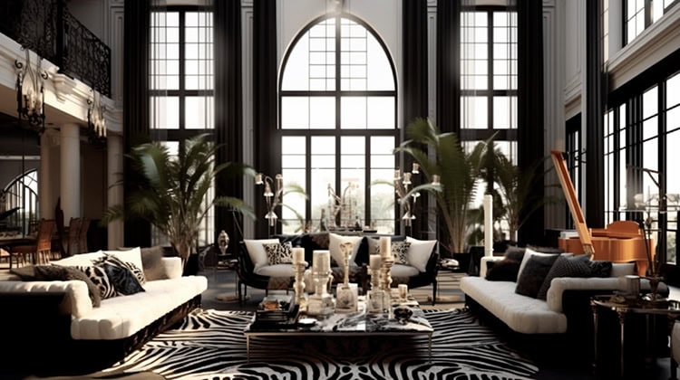
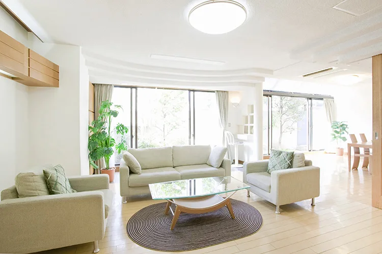
When it comes to interior design, the principles of symmetry are much simpler: place the same weight on the left and right parts of the room (symmetrical), or place several small items on one side to balance a large object on the other side (asymmetrical).
See how they are both visually balanced in their own special way?
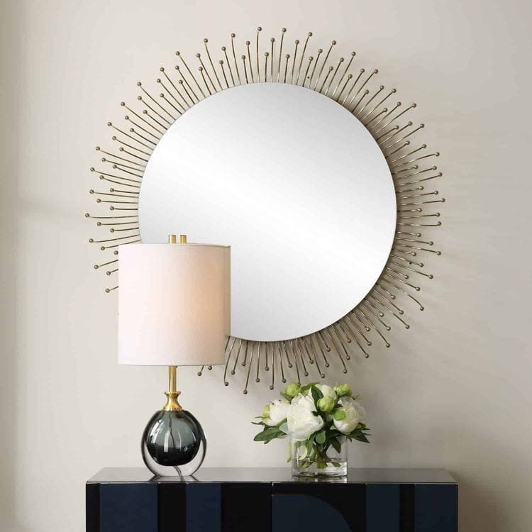
The same goes for styling, for example, an entryway or sofa table. You could keep it obviously symmetrical by placing identical lamps and accessories as mirror images of one another, or, offset one larger lamp with some smaller accessories on the other side for a more asymmetrical look.
Again, when it comes to symmetry in design, it’s all about your preference. Whatever look is your favorite is the one you should go for. As long as the space looks intentional, with a visible sense of harmony and balance, it’ll be beautiful.
Need some pieces to incorporate for more symmetry? Come stop by the showroom or browse online for fabrics to make custom pillow covers or accent chairs. We also have a varied selection of gorgeous accessories that are sure to have the space looking both beautiful and balanced.

