Every season, the Pantone Color Institute sets the trends in color forecasting during Fashion Week in both London and New York. But just because these colors strut their stuff up and down the runway, by no means must they stay there. Quite the opposite, in fact. Take one look at these beautiful hues in Pantone’s Color Trend Report and it’s pretty obvious that it serves as a guide to the latest color trends that far extend into the realm of interior design and decorating as well.
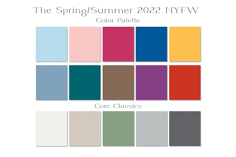
For Spring/Summer 2022, Pantone aims to bring us balance in this ever-changing world. Our need for clarity, comfort, and security, as well as our desire for spontaneity, uplift, and joy, are colorfully counterbalanced through this eye-catching palette that ranges from the soft and sweet to the powerful and dramatic.
“Colors for Spring 2022 bring together our competing desires for comforting familiarity and joyful adventure through a range of soothing and timeless colors, along with joyous hues that celebrate playfulness. As we enter this new landscape…hues for Spring 2022 allow us to mix and marry as we please, encouraging the exploration of new chromatic realities, opening the door for personalized style and spontaneous color statements,” said Leatrice Eiseman, Executive Director of the Pantone Color Institute.
Fashion Color Trend Report: New York Fashion Week Spring/Summer 2022 | Pantone
The 2022 spring/summer color palette includes:
- PANTONE 12-4401: Spun Sugar
- PANTONE 13-1513: Gossamer Pink
- PANTONE 18-2042: Innuendo
- PANTONE 19-4151: Skydiver
- PANTONE 14-0850: Daffodil
- PANTONE 16-4118: Glacier Lake
- PANTONE 18-4728: Harbor Blue
- PANTONE 18-1019: Coca Mocha
- PANTONE 18-3324: Dahlia
- PANTONE 18-1564: Poinciana
The 2022 spring/summer core classics include:
- PANTONE 11-0602: Snow White
- PANTONE 13-0003: Perfectly Pale
- PANTONE 16-6216: Basil
- PANTONE 14-4104: Northern Droplet
- PANTONE 18-4004: Poppy Seed
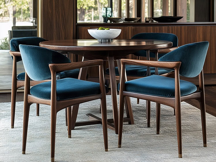
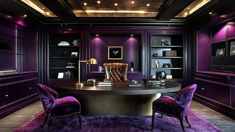
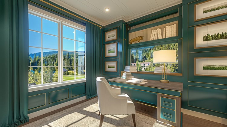
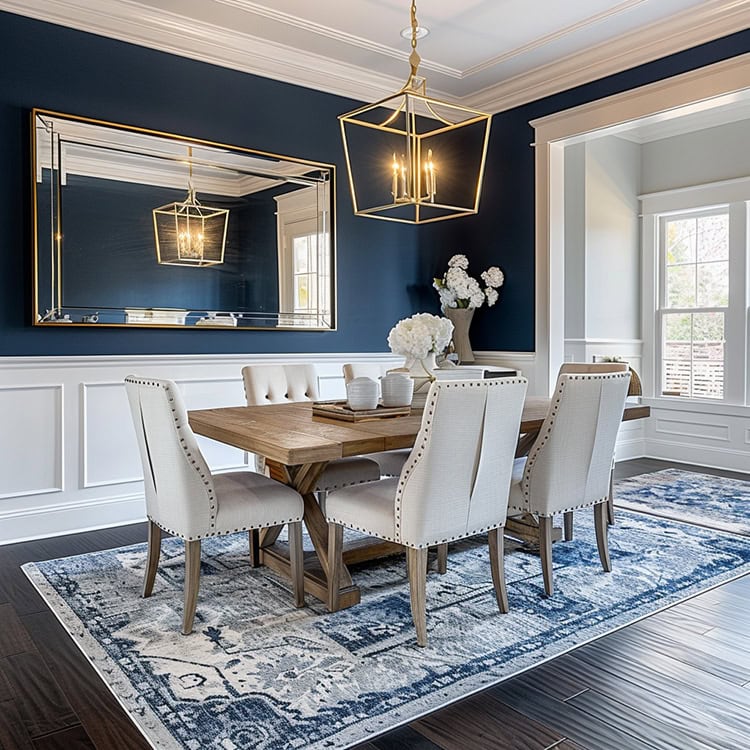
Using the Palette in Your Home
A palette like this can make it a real challenge not just in choosing what colors to use, but also where to use them. The good news is you are in total control! Do you go with bright colors? The more subdued ones? Both? It’s up to you!
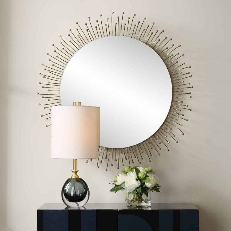
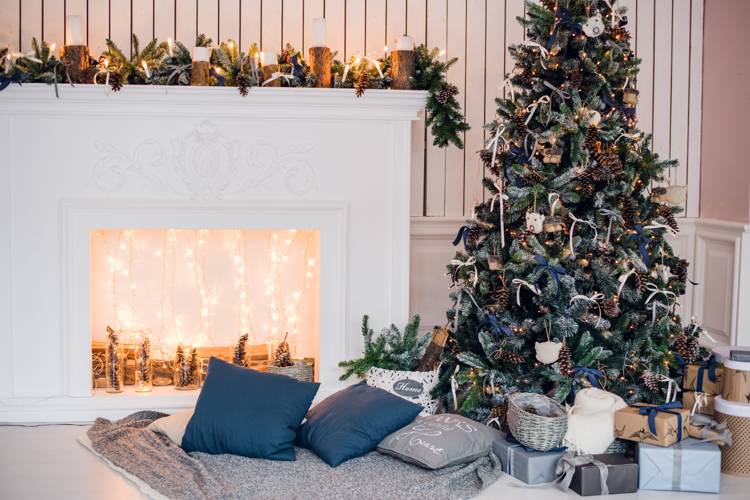
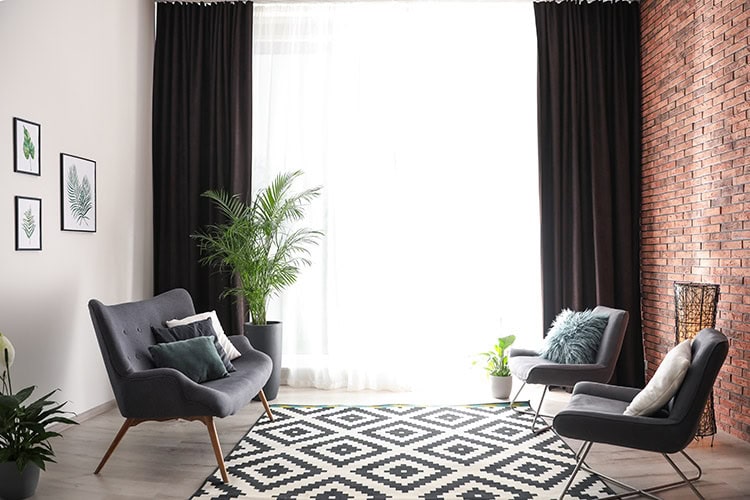
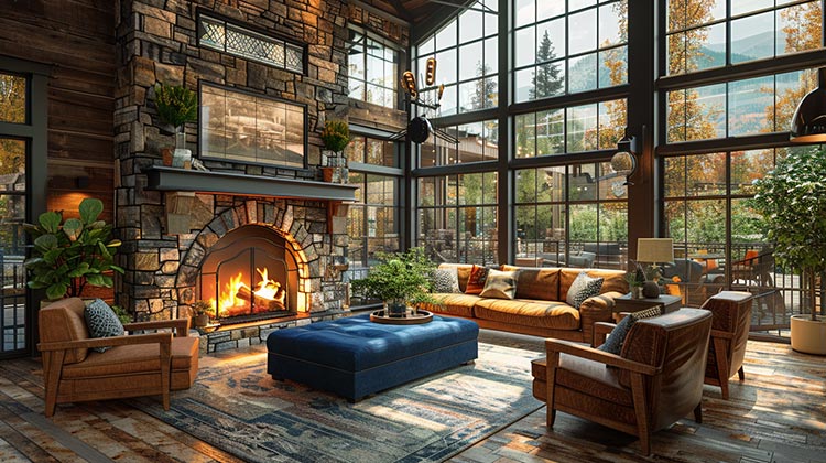
If you love the idea of color, but not in large quantities, start small with accessories. Throws, accent pillows, vases, table lamps, rugs, and even floral arrangements are just some of the ways you can add vibrancy to your home without going overboard. Layer in those beautiful statement colors among a more subdued foundational palette. If you have no fear, go all in! An accent wall, an upholstered chair, or a painted piece of furniture should do the trick!
Whether you choose to use these colors in a big or small way, any use is sure to liven up your space and give a nod to the upcoming seasons. When the time comes to incorporate some fresh hues, be sure to stop by one of our showrooms to see what fabrics and accessories we have that can add pops of this palette to your home.

