Maintaining Professionalism in Bold Designs
While embracing color-drenched spaces and distinctive upholstery, ensure your office maintains professional credibility. Welcome to the next installment in our Build-a-Room Series, where we explore how strategic upholstery choices and confident color decisions can transform your home office into a space that enhances both performance and wellbeing.
Background Considerations
- Test how your drenched color appears on camera—some deep colors can actually create a remarkably flattering background for video calls
- Create proper lighting to ensure your bold color choice reads accurately on screen
- Consider how your chosen color affects your appearance during virtual meetings
Balance and Cohesion
- In color-drenched spaces, maintain cohesion through consistent application
- Allow furniture and technology to stand out as functional elements
- Consider how art and accessories will either blend with or purposefully contrast your dominant color
Adapting Bold Choices to Home Integration
Unless your home office occupies a completely separate structure, consider how its design relates to adjacent spaces:
Transitional Elements
- Use doorways as natural transition# Productive Spaces: Designing a Home Office That Works
The rise of remote work has transformed the home office from an occasional convenience to an essential space where productivity, creativity, and professionalism must seamlessly blend. While functional elements like proper lighting and ergonomics form the foundation of an effective workspace, it’s often bold color choices and thoughtfully selected upholstery that create an environment that both energizes and comforts throughout the workday.
Welcome to the next installment in our Build-a-Room Series, where we explore how strategic upholstery choices and confident color decisions can transform your home office into a space that enhances both performance and wellbeing.
The Psychology of Color in Workspaces
Color profoundly impacts mood, cognitive function, and productivity—making it a crucial consideration for home office design. Moving beyond standard neutrals allows you to create a space that actively supports your work style and psychological needs.
Productivity-Enhancing Color Strategies
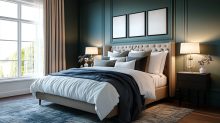
- Navy Blue: Promotes concentration and intellectual thought, making it ideal for spaces requiring focus and analytical thinking. Deep navy walls create a sophisticated backdrop that maintains professionalism while offering more character than basic white.
- Forest Green: Associated with balance and harmony, rich green tones reduce eye strain and create a sense of wellbeing during long work sessions. Consider a forest green accent wall behind your desk to create both visual interest and cognitive benefits.
- Energizing Red: Used strategically, crimson and burgundy tones stimulate energy and passion—perfect for creative professionals or anyone needing motivational boosts. Rather than overwhelming full walls, incorporate these powerful tones through upholstered pieces or substantial accessories.
- Balancing Teal: Combining the focus-enhancing properties of blue with green’s balancing effects, teal creates an ideal environment for multitaskers. This versatile color works well for both wall treatments and statement furniture.
Embracing Color Drenching: Total Immersion in Bold Hues
While conventional wisdom once suggested limiting bold colors to accents, the technique of “color drenching” proves that total immersion in a single rich hue can create extraordinarily effective workspaces. This approach involves applying one dominant color across multiple surfaces and elements—walls, trim, cabinetry, and even ceiling—creating a cohesive, enveloping environment.
The Power of Monochromatic Depth
- Psychological Cocoon: A fully color-drenched office creates a psychological container that enhances focus and minimizes distraction. The unified visual field allows the mind to settle more deeply into tasks.
- Architectural Enhancement: Applying a single color across architectural elements including trim, built-ins, and doors emphasizes the forms themselves rather than the transitions between them, creating a more sophisticated space.
- Expanded Perception: Contrary to conventional wisdom, drenching smaller offices in rich, dark colors like aubergine, navy, or forest green can actually make them feel larger and more substantial by blurring the boundaries between surfaces.
Execution Approaches
- Complete Commitment: Apply your chosen color to all surfaces—walls, ceiling, trim, built-ins, and doors—for maximum impact and cohesion. This works particularly well with jewel tones that have both depth and richness.
- Strategic Variation: Use the same color in slightly different finishes—perhaps matte on walls, satin on trim, and high-gloss on select cabinetry—to create subtle dimension while maintaining the drenched effect.
- Tonal Drenching: Apply colors from the same family but in varying intensities, such as a range of blues from navy to cornflower across different elements.
Ideal Shades for Color Drenching an Office
Some colors perform particularly well in drenched applications for workspaces:
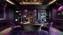
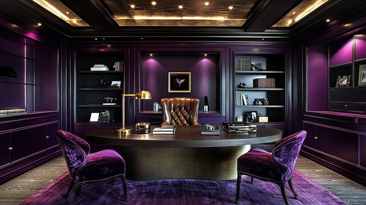
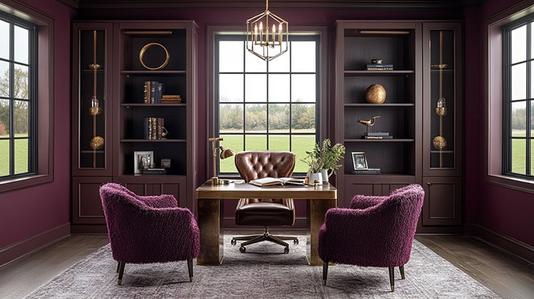
- Deep Purple: Rich Aubergine, or eggplant tones, create a sophisticated, luxurious environment that stimulates creativity while maintaining an executive presence. When paired with caramel leather and brass accents, this dramatic hue establishes both authority and imagination—perfect for decision-makers who want to make a confident statement.
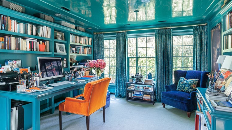
- Vibrant Teal: This energetic blue-green creates an immersive creative environment that balances focus with artistic energy. The reflective quality of high-gloss teal finishes can amplify natural light while creating a sense of possibility and innovation.
- Forest Green: Creates an immersive natural environment that reduces stress while maintaining energy. The biophilic connection to nature helps sustain concentration during long work sessions while creating a sense of wellbeing and balance.
- Indigo Blue: Provides the focus-enhancing benefits of blue with additional depth and sophistication, perfect for spaces requiring deep concentration and analytical thinking. This rich, complex blue creates a cerebral atmosphere that supports intensive problem-solving.
Complementing the Drenched Space
While color drenching creates a powerful foundation, thoughtfully selected accent colors can enhance specific work functions:
- Enhance Through Similarity: For example… upholstery and textiles in varying shades and textures of your primary color for sophisticated depth.
- Punctuate Through Contrast: One way to do that is to select a few elements in a clear contrast color—such as a mustard yellow desk chair in a navy-drenched office—to create deliberate focal points.
Strategic Accent Colors
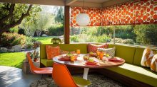
- Orange Accents in Creative Spaces: Vibrant orange—whether in a statement desk chair, decorative accessories, or small furniture pieces—provides the perfect energizing counterpoint to cooler tones like teal or indigo. Orange stimulates enthusiasm, creativity, and communication, making it ideal for spaces where innovation and original thinking are priorities.
- Mustard Yellow for Focus Areas: This sophisticated yellow variant introduces warmth and optimism without the overwhelming brightness of primary yellow. When paired with navy or deep purple surroundings, mustard accents in upholstery or lighting create an intellectual energy that supports analytical work while preventing the space from feeling too somber.
- Emerald Green in Balanced Environments: As an accent in neutral or blue-dominated offices, emerald introduces a natural element that promotes balance and decision-making clarity. This jewel tone works particularly well in spaces where both creative and analytical thinking are required.
- Burgundy for Authority: In executive spaces, burgundy accents convey heritage, confidence, and thoughtfulness. When introduced through leather desk accessories, upholstered guest seating, or textiles against charcoal or navy backdrops, burgundy creates a sense of established expertise and careful consideration.
- Copper and Brass Metallics: Though not traditional colors, these warm metallics function as essential accents in color-drenched spaces. Desk lamps, hardware, or decorative objects in these finishes add dimension and sophistication while reflecting light in ways that enliven even the most deeply saturated environments.
The power of these accent choices comes from their strategic application—introducing them through key furniture pieces, textiles, or accessories rather than competing wall colors, maintaining the psychological benefits of the drenched environment while adding functional energy where needed.
Upholstery: Where Comfort Meets Performance
Office upholstery must balance comfort for long work sessions with durability and aesthetic impact. These elements significantly influence both how your office functions and how it feels.
The Command Center: Your Desk Chair
No piece of office furniture impacts your daily experience more directly than your desk chair, making it worthy of significant investment in both performance and appearance.
Upholstery Considerations
- Performance Fabrics: Look for commercial-grade textiles with high rub counts (30,000+ Wyzenbeek cycles) that maintain appearance through years of daily use.
- Temperature Regulation: Consider breathable fabrics like merino wool blends that balance warmth and cooling properties for all-day comfort.
- Texture Contrasts: Create visual interest by selecting chair upholstery with textural elements—perhaps a bouclé or subtle woven pattern that adds dimension.
Color Strategy
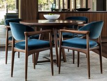
- Statement Seating: A desk chair in a bold color like emerald green, sapphire blue, or even rich burgundy creates a focal point while energizing your workspace.
- Complementary Contrasts: Select chair upholstery that creates purposeful contrast with your walls—a mustard yellow chair against navy walls or a deep plum chair against sage green.
- Pattern Integration: Consider chairs featuring geometric patterns that incorporate your color scheme while adding visual complexity.
Secondary Seating: Comfort and Versatility
Many home offices benefit from secondary seating that accommodates brief meetings, provides alternative working positions, or offers space for contemplative breaks.
Upholstery Options
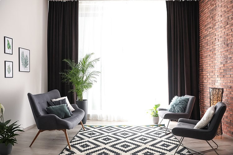
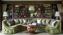
- Substantial Armchairs: A fully upholstered armchair in a rich jewel tone creates both visual weight and functional comfort for reading or thinking tasks.
- Sophisticated Swivel Chairs: Barrel-shaped swivel chairs upholstered in performance velvet or textured weaves offer flexibility for engaging with different areas of your office.
- Tailored Slipper Chairs: Armless slipper chairs in bold colors provide straightforward seating without overwhelming smaller offices.
Material Selection
- Velvet: Creates rich depth of color and sound-dampening properties, particularly in jewel tones like sapphire, emerald, or amethyst.
- Structured Wools: Offer durability and natural temperature regulation with sophisticated texture.
- Performance Twills: Provide excellent durability while offering extensive color options.
Multifunctional Solutions
For offices needing to accommodate guests or occasional overnight visitors, consider these dual-purpose upholstered pieces:
- Sleeper Chairs: Fully upholstered chairs that convert to twin beds, ideally in stain-resistant performance fabrics.
- Daybed Configurations: A tailored daybed with bolster pillows serves as both meeting seating and guest accommodation, providing an opportunity for dramatic upholstery in rich, saturated colors.
- Storage Ottomans: Multifunctional ottomans with hidden storage upholstered in complementary colors that serve as both seating and organization solutions.
Creating Acoustic Comfort Through Textiles
Home offices often suffer from poor acoustics that affect both concentration and professional call quality. Strategic upholstery and textile choices can significantly improve sound quality.
Sound-Absorbing Solutions
- Upholstered Wall Panels: Consider acoustic wall panels upholstered in coordinating fabrics that dampen sound while adding color and texture.
- Substantial Drapery: Full-length window treatments in heavyweight fabrics reduce echo and external noise while incorporating bold color.
- Upholstered Screens: Fabric-covered folding screens create flexible divisions while improving acoustics and adding color opportunity.
Bold Color Through Office Accessories
Beyond walls and furniture, accessories provide opportunities to incorporate color with lower commitment.
Textile Accents
- High-Impact Pillows: Decorative pillows for office seating in contrasting colors or patterns that create visual interest.
- Substantial Table Coverings: Consider desk blotters or side table coverings in rich leather or suede that add color at key touchpoints.
- Artisanal Touches: Handcrafted textile pieces like wall hangings or table runners that introduce complex color and texture.
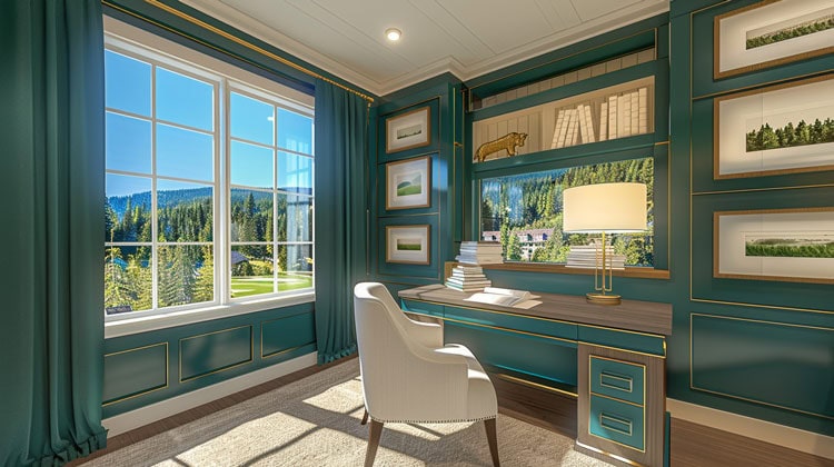
Window Treatments: Controlling Light and Adding Color
Office window treatments must balance light control for screen visibility with energizing natural illumination.
Functional Considerations
- Light Management: Select solutions that eliminate glare on screens while maintaining access to natural light.
- Privacy Control: Ensure appropriate coverage for video calls and focused work periods.
- Energy Efficiency: Insulating options that maintain comfortable temperatures throughout the day.
Style Approaches
- Roman Shades: Tailored fabric shades in bold solid colors or subtle patterns that fold neatly when raised.
- Layered Solutions: Combining sheer privacy layers with more substantial light-blocking panels in complementary colors.
- Inside-Mount Options: Clean-lined treatments installed within window frames for architectural precision.
Creating Zones Through Color and Upholstery
For larger home offices or multipurpose spaces, use color and upholstery to create distinct functional areas:
Work Zone
- Primary desk area defined by the boldest color application
- Highest performance upholstery for main task chair
- Optimized lighting and technology integration
Thinking/Reading Zone
- Secondary space with comfortable upholstered seating
- Perhaps a slightly softer color palette that maintains coordination
- Task lighting specific to reading or contemplative work
Meeting Zone
- If space allows, a dedicated area for client or colleague interactions
- Upholstery that balances professionalism with comfort for longer conversations
- Color choices that energize discussion while maintaining focus
Bringing It All Together: Bold Color Strategies
Creating a successful color strategy requires thoughtful consideration across all elements:
The Drenched Monochromatic Approach
- Select a single powerful hue like emerald, aubergine, or charcoal
- Apply it across walls, trim, cabinetry, and potentially ceiling for immersive effect
- Create interest through textural variations and subtle finish differences
- Add depth with varying saturations of the same color family
The Strategic Complementary Scheme
- Choose two complementary colors (opposite on the color wheel)
- Consider using one for your color-drenched background and the other for significant upholstered pieces
- Balance the visual weight of each color based on their intensity
The Classic Triad
- Select three colors equally spaced around the color wheel (like burgundy, forest green, and navy)
- Consider fully drenching one zone in each color for a dramatic but cohesive multi-functional space
- Use furnishings and accessories that incorporate elements of all three colors to unify the space
Real-World Applications
Consider these specific home office color and upholstery combinations that successfully balance productivity and personality.
The Creative Professional’s Studio
- Walls, trim, built-ins, and ceiling in a fully drenched rich teal that promotes both focus and creativity
- Primary desk chair upholstered in vibrant burnt orange performance velvet as a strategic contrast
- Secondary reading chair in a deeper peacock blue textured wool that complements the teal surroundings
- Window treatments in the same teal as walls but with subtle textural pattern for dimension
The Executive Home Office
- Sophisticated color-drenched space using deep aubergine applied to walls, millwork, built-in cabinetry, and ceiling
- Primary desk chair in caramel leather for striking contrast against the rich purple background
- Guest seating in aubergine mohair that blends with the walls but adds textural interest
- Substantial wool rug incorporating aubergine with accents of brass and caramel
The Multitasking Command Center
- Fully drenched forest green environment including walls, ceiling, and all woodwork
- Ergonomic task chair upholstered in a vibrant chartreuse performance fabric that energizes while complementing the green surroundings
- Secondary seating in emerald velvet that strengthens the drenched effect
- Bold geometric rug incorporating various shades of green with black and white accents
Maintaining Professionalism in Bold Designs
While embracing color and distinctive upholstery, ensure your office maintains professional credibility:
Background Considerations
- Position bold colors and patterns thoughtfully in relation to video call setups
- Create at least one area with a more neutral background for formal interactions
- Test how colors appear on camera before committing to permanent changes
Balance and Restraint
- Limit the boldest color expressions to 1-2 key areas
- Allow for visual rest through some neutral elements
- Consider the overall impression for clients or colleagues who may visit
Adapting Bold Choices to Home Integration
Unless your home office occupies a completely separate structure, consider how its design relates to adjacent spaces:
Transitional Elements
- Identify colors that can serve as bridges between your office and connecting rooms
- Consider how door treatments and hallway spaces can ease transitions
- Create purposeful connections rather than jarring separations
Flexible Timing
- Implement bold color choices when you can make complementary adjustments to adjacent spaces
- Consider the long-term interior design plan for your entire home
- Phase dramatic changes if necessary to maintain whole-home cohesion
Your home office should reflect both professional requirements and personal preferences, creating a space where you feel energized, focused, and authentically represented. Through thoughtful upholstery selections and confident color choices, you can create a workspace that enhances productivity while providing genuine comfort for the many hours spent there.
Join us next time as our Build-a-Room Series continues with “MCM: Designing the Ultimate Eat-In Kitchen.”