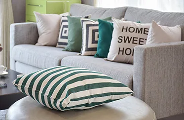
Stripes, whether used traditional way or an unconventional one, promote visual order to a room. Not only do they direct the eye naturally, they can help reshape a space. Furthermore, being that they are the most neutral pattern out there, stripes mix beautiful with solids and other patterns, making them extremely easy to incorporate anywhere in your home.
Vertical vs. Horizontal
Traditionally, vertical stripes have been the most common form of use. This is probably because they create an illusion of height, making low ceilings feel higher. When it comes to the look you’re going for, muted tone-on-tone colors give the space a classic look, while more contrast makes the space look bold and powerful.
Horizontal stripes are a bit more modern and edgy than vertical stripes. When used in varied colors and widths, these stripes can be playful, creating a fun and fresh atmosphere. Additionally, if you need to make a room feel longer, cozier, or appear to have more definition, then horizontal stripes are the way to go.
Where to Use Them
Since stripes are so versatile, they can be used just about anywhere and everywhere. Here’s a list to get you started:
- Photo frames and artwork
- Bedding
- Shower curtains
- Bench or chair cushions
- Couch slipcover
- Accent chair
- Ottoman
- Bar stools
- Dishes
- Window treatments
- Table linens
- Towels
- Dresser drawers (horizontal only)
- Accessories like throw pillows, vases, coasters, lampshades and rugs
Some don’ts to consider:
- Don’t overdo striped pillows when using striped bedding
- Don’t use neon colored stripes on furniture
- Don’t use more than two or three complimentary colors
- Don’t do a striped floor (stick with a rug)
- Don’t paint stripes on shutters or front doors
- Don’t paint fan blades
- Don’t use stripes on everyday glassware or silverware/
Additional Tips and Tricks
1) Pick colors that contrast or compliment, rather than colors that clash. Colors that clash will cause disconnect and confusion.
2) Use strong, contrasting stripes in unexpected areas like powder rooms and closets.
3) The size of the stripes should match the room. Stick with thinner stripes for smaller rooms and wider stripes for larger rooms.
4) Make the space look cohesive by blending a solid and a floral with your stripes. A solid, paired with a large stripe, a narrow stripe and a paisley, is a good example of a balanced palette.
5) Start small until you’re ready to commit to something bigger.
As mentioned earlier, stripes are considered the “neutral” of the pattern world, so they are very easy to incorporate into your home. If you aren’t sure where to begin, stripes are a safe bet.
Visit us at CUTTING CORNERS, to check out the latest designer upholstery fabrics available at amazing prices.

