Bold Color in Small Spaces: Making a Statement in Compact Rooms
The conventional wisdom has long suggested that small spaces should be painted in light, neutral colors to make them appear larger. But what if we told you that embracing bold, vibrant color could transform your compact room from merely functional to absolutely unforgettable?
Welcome back to our Build-a-Room Series, where today we’re exploring how to use dramatic color to create impact in smaller spaces. Gone are the days of playing it safe—it’s time to make your small room the most captivating area in your home.
 Why Bold Colors Work in Small Spaces
While it’s true that light colors can create an illusion of spaciousness, bold colors offer something different but equally valuable: they create dimension, character, and intentionality. A small room with dramatic color becomes a jewel box rather than an afterthought.
Today’s interior design has moved well beyond the “millennial gray” phase that dominated the 2010s. Homeowners and designers alike are embracing color again—not the overwhelming patterns and wallpapers of decades past, but thoughtful, strategic color that makes spaces feel current and personally curated.
Consider these compelling reasons to embrace color in compact areas:
- Creates a Destination: Bold color transforms a small room from a pass-through space into a destination
- Defines Purpose: Strong color choices help clearly define the function of the space
- Showcases Personality: Small rooms can handle more dramatic personal expression without overwhelming your entire home
- Controls Visual Perception: Strategically placed color can actually reshape how we perceive dimensions
Choosing Your Statement Color
The key to success lies in selecting the right bold color for your space. Consider these approaches:
Dramatic Depth with Dark Hues
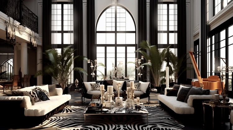
Deep navy, forest green, charcoal, or even black can create remarkable depth in small spaces. Contrary to popular belief, these colors don’t necessarily make rooms feel smaller—they can actually make walls recede by blurring the boundaries of the space.
These dramatic backdrops also create a perfect canvas for artwork and accessories to truly shine. Metallic accents and light-colored furniture pop beautifully against these deeper backgrounds.
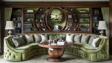
Vibrant Energy with Jewel Tones
Emerald green, sapphire blue, ruby red, or amethyst purple inject instant energy and sophistication. These colors have both intensity and depth, making them perfect for spaces where you want to create impact without appearing chaotic.
Jewel tones work particularly well in spaces meant for gathering or conversation, as they create an atmosphere of warmth and stimulation.
Unexpected Sophistication with Saturated Mid-Tones
Terracotta, mustard yellow, olive green, or slate blue offer bold presence without the intensity of brighter hues. These colors have a grounded quality that adds both character and comfort to small spaces.
Mid-tones excel in rooms where you want to create atmosphere without overwhelm, offering sophistication that feels contemporary yet timeless.
Strategic Color Placement
Where you apply bold color can be just as important as which color you choose. Consider these strategic approaches:
All-In Immersion
 Painting all walls, trim, and even the ceiling in your chosen bold color creates a cocoon-like effect that can be remarkably successful in small spaces. This approach:
- Blurs the boundaries of the room
- Creates a sense of luxury and intention
- Makes the actual dimensions of the space less noticeable
- Provides a dramatic backdrop for furniture and art
This technique works particularly well in powder rooms, home offices, or cozy reading nooks where the immersive quality enhances the room’s function.
Strategic Accent Walls
If full color immersion feels too committed, consider a strategic accent wall. The key is choosing the right wall:
- In rectangular rooms, paint the shortest wall to visually correct proportions
- In rooms lacking architectural interest, paint the wall you want to highlight
- In rooms with a focal point (fireplace, window with a view), enhance it with color
Remember that an accent wall should feel intentional rather than random. It should anchor the space and relate to other design elements in the room.
Unexpected Color Moments
Sometimes the most effective use of bold color comes from unexpected applications:
- A painted ceiling (sometimes called the “fifth wall”)
- Interior door faces in a statement color
- Window frames and trim in a contrasting hue
- Built-ins or architectural details highlighted with color
These surprising color moments create visual interest without overwhelming the space.
Balancing Bold Color with Complementary Elements
The success of bold color in small spaces often depends on how you balance it with other elements:
Thoughtful Furniture Selection
In color-rich rooms, furniture should be carefully considered:
- Choose pieces with clean lines to avoid visual clutter
- Consider furniture that blends with your wall color for a seamless look
- Alternatively, create dramatic contrast with light pieces against dark walls
- Limit the number of furniture pieces to maintain breathing room
Strategic Lighting
Lighting becomes even more crucial in boldly colored small spaces:
- Incorporate multiple light sources at different heights
- Consider the color temperature of your bulbs (warmer lighting often complements bold colors better)
- Use directional lighting to highlight architectural features or art
- Remember that dark colors absorb more light, so increase your lighting accordingly
Thoughtful Accessorizing
With bold wall colors, accessories require a disciplined approach:
- Be more selective with decorative objects
- Consider the color theory relationships between your wall color and accessories
- Create moments of contrast for visual interest
- Remember that negative space becomes even more important
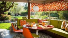
Small Spaces That Benefit from Bold Color
Some compact areas are particularly well-suited to dramatic color treatments:
Powder Rooms
These small spaces were made for bold expression. Without the moisture concerns of full bathrooms, powder rooms can showcase dramatic wallpapers, rich paint colors, and striking contrasts.
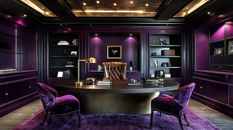
Home Offices
A bold color treatment can help define a small home office as a distinct space, especially in open floor plans or converted closets. The color creates both visual separation and psychological focus.
Reading Nooks
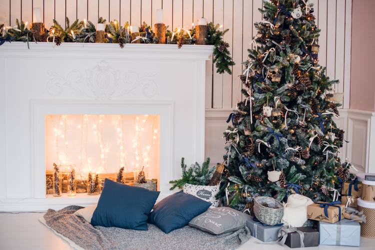
Small reading corners benefit enormously from cocooning color that creates a sense of escape and comfort. Deep blues and greens are particularly effective for these contemplative spaces.
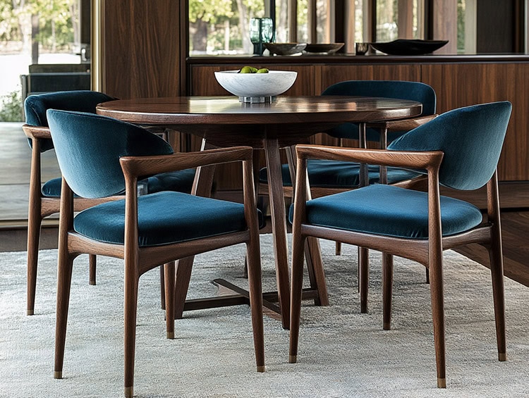
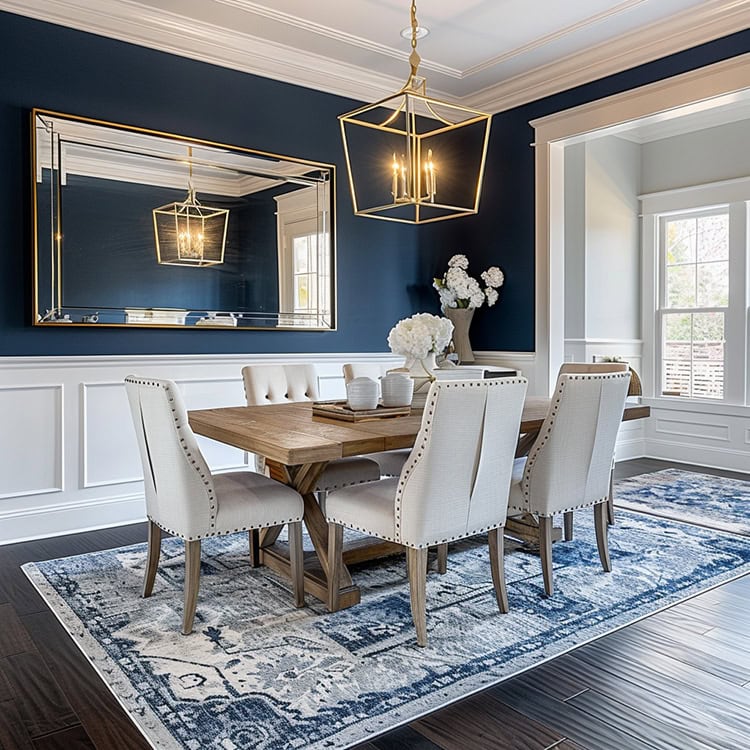
Dining Areas
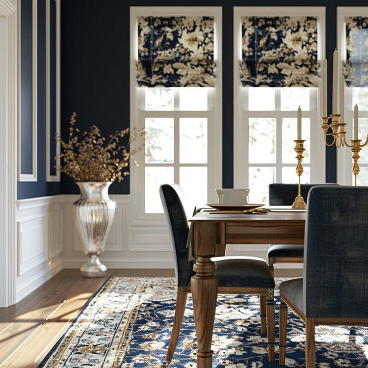
Compact dining spaces come alive with rich color, creating an intimate atmosphere for gathering. Even a small dining area can become a memorable space for entertaining with the right color treatment.
Real-World Examples That Work
Consider these specific color applications that have proven successful in small spaces:
- A small or mid-size home office in deep peacock blue with brass accents and light wood furniture
- A compact powder room in high-gloss burgundy with gold fixtures and minimal accessories
- A small reading nook in forest green with a contrasting mustard yellow reading chair
- A tiny dining area with walls in terracotta that visually separates it from an adjacent kitchen
Common Concerns Addressed
“Won’t dark colors make my small room feel like a cave?”
Not with proper lighting. The key is ensuring adequate illumination from multiple sources. Dark colors can actually create a sense of expansiveness by blurring boundaries.
“How do I know if I’ll like living with such bold color?”
Start with removable wallpaper or even a large piece of painted foam board to test the effect. Living with the color temporarily can help you determine if it’s right for you.
“What if I want to sell my home later?”
The real estate landscape has evolved significantly in recent years. While neutrals were once the only “safe” choice for resale, today’s buyers are often drawn to thoughtfully designed spaces with character. A well-executed bold color scheme can actually become a memorable selling point that helps your home stand out from the endless “millennial gray” properties on the market.
Real estate agents increasingly report that homes with strategic pops of color—particularly in smaller spaces like powder rooms or dining nooks—can signal that a property is current and well-maintained. The key is professional execution with colors that feel intentional rather than random or dated.
As one design-savvy realtor put it: “Buyers today would rather see a beautifully designed emerald green powder room they can easily change if desired than a badly executed beige space that suggests the entire home hasn’t been updated in years.”
Final Thoughts: Embracing Boldness
Small spaces offer the perfect opportunity to explore color in ways you might not attempt in larger rooms. By embracing bold hues in compact areas, you create memorable moments within your home that express personality and purpose.
Remember that the most successful spaces often come from thoughtful risk-taking rather than playing it safe. Your small room might just become the space that everyone remembers—and the one you enjoy most.